Fierce Island Web Design
Web Design Based in Boise, Idaho
Your work is
better than your
website shows.
We help established Boise businesses close the gap with websites, SEO, Google Ads, and local marketing that actually bring in the right clients.
As Seen On
Who we are
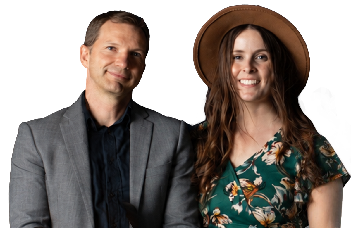
Hi, we're Jared and Rachelle.
A Boise-based web design team that works with a small number of clients at a time so every project gets our full attention. No account managers, no outsourcing. You work directly with us from strategy to launch.


If your business has outgrown its website, you're not alone.
- Your site doesn't reflect the quality of your work
- You look smaller online than you actually are
- Leads aren't consistent or aren't the right fit
- Competitors feel more credible, even when they're not
Most businesses in this position have either outgrown a DIY site they built early on, or they hired someone who gave them something generic and called it done. The result looks fine on the surface but does not actually do anything. It does not position you. It does not convert. It just exists.
The framework behind every Fierce Island website
Business owners across Idaho trust this process.
Strategy & Positioning
We define your positioning, target customer, and offer before a single pixel is designed.
In practice: A discovery session where we learn your business, your competitors, and what makes your best clients choose you.
Conversion-Focused Design
Page structure, trust signals, and CTA flow engineered to turn visitors into leads.
In practice: Sitemap, wireframes, and custom visual design that reflects the quality of your business and tells visitors exactly what to do next.
Performance Engineering
Fast load times and a technical SEO foundation baked into every build.
In practice: Built on Next.js for speed, semantic HTML throughout, and SEO foundations in place before we ever hit publish.
Growth Support
When you’re ready to scale, we layer in SEO, GEO, and paid media without adding new vendors.
In practice: One partner for web design, local SEO, GEO/AEO, Google Ads, and ongoing support. No juggling five different agencies.
Recent Projects

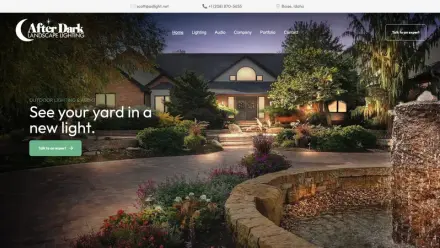
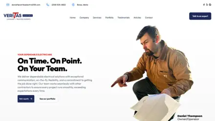
Landscaping Contractor
Fine Grade Concrete, Landscapes & More
Fine Grade is a family-owned landscape and concrete company serving Boise and the Treasure Valley. The owner, Dillon, builds at a craftsman level...full backyard installs, stamped concrete patios, ret

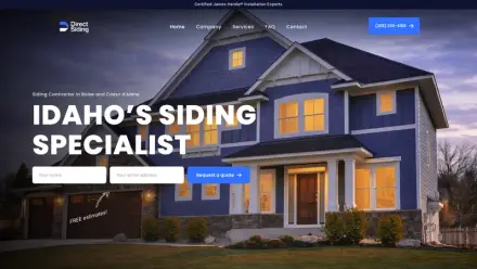
Service trades
Direct Siding
Direct Siding was preparing to expand into Boise with a new location, and owner Aaron Mote needed more than a few website updates. He needed a stronger digital foundation for growth. Fierce Island par

Finance
The Sessions Group Mortgage
The problem Gavin Sessions had been building a mortgage brokerage practice in Boise, Idaho for years. He had genuine expertise, a loyal client base, and a YouTube channel — More Than A Mortgage — wher

Legal
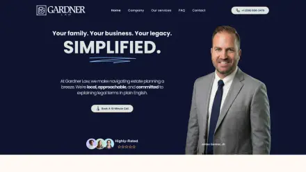
Gardner Law
Jordan Gardner knew something was off. His law firm was growing. His reputation was strong. Clients trusted him. But his website didn’t reflect the level of professionalism, clarity, and care he bring

Education
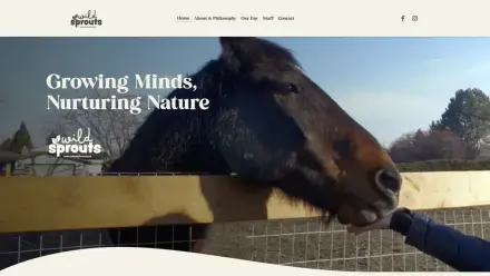
Wild Sprouts Homestead Preschool
Wild Sprouts Homestead Preschool was ready to step into a new season. Torie came to us looking for her very first website. Something that felt warm, inviting, and aligned with her vision for nature-ba

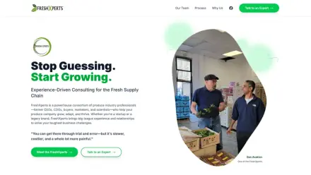
Agriculture
The FreshXperts
FreshXperts is a specialized consulting group serving the fresh produce industry — from supply chain strategy to operational efficiency. Their expertise was clear. Their digital presence wasn’t. The e
What a Fierce Island website changes
Real outcomes from businesses that stopped settling for a site that just exists.
Higher perceived value
A premium website allows you to justify premium pricing. When your online presence matches the quality of your work, clients stop questioning your rates before they even call.
“End results of my website were awesome, and the process was smooth from start to finish. 10 times better than my old sites.”
— Scott Ruhoff
More trust, more inquiries
Visitors who trust you are far more likely to reach out. Clear messaging, real social proof, and a site that feels intentional all signal that you’re the kind of business worth calling.
“We’ve already received compliments from customers. The final product looks clean, modern, and professional.”
— Joshua Cortez
Faster site, lower drop-off
Speed keeps visitors engaged instead of bouncing to competitors. Every Fierce Island build is engineered for performance so the first click doesn’t become the last one.
“I have seen a strong increase in calls. Fierce Island Web Design has worked very hard for my company.”
— Jeff Doan
Clear messaging, better-fit leads
The right words attract the right customers and filter the rest. When your site speaks directly to your ideal client, you spend less time on the wrong conversations.
“They were patient with us from the beginning and started with a lot of listening. They spent time sitting with us and learning about our church and the website we wanted to build.”
— Katrina Moreno
Everything your website needs to grow
One partner for design, SEO, and paid media. No vendor juggling.
Web Design & Development
Custom websites built on Next.js. These sites are fast, conversion-focused, and designed to reflect the quality of your business. Strategy, design, and development under one roof.
- Custom design
- Next.js build
- Sanity CMS (optional)
- Conversion architecture

SEO, GEO & Organic Growth
Technical, local, and on-page SEO plus GEO and AEO, so you earn rankings in Google and get cited by AI search like ChatGPT.

Google Ads & Paid Media
Performance-focused Google Ads campaigns that turn budget into booked jobs. Search ads, landing pages, tracking, and budget optimization.

Here's what our clients have to say.
Many businesses like yours have seen an increase in customers with our services.
Ready to do it right
A Boise web design investment that positions your business correctly and converts the right clients pays for itself. Most of our projects typically land around $6,400 — which is what businesses come to us with when a DIY site or template website has already cost them more than that in missed opportunities. We have packages at every price point.
No templates. No outsourcing. Custom design, Next.js build, SEO foundations, and a launch partner who stays available after the site goes live. When you're ready to grow beyond the website, we layer in digital marketing without adding new vendors.

Who we're best for
We work with a small number of clients at a time so every project gets our full attention. When we're at capacity we maintain a waitlist.
Best for
- Established businesses with revenue and a proven offer
- Companies ready to upgrade from DIY or template websites
- Business owners who want one partner handling web design, SEO, and digital marketing in Boise
Not a fit
- Pre-revenue startups looking for the cheapest option
- “Just need something quick” without a clear direction
- Unlimited revision cycles with no defined goals
Frequently asked questions about web design in Boise
Common questions from businesses exploring website design, SEO, and digital marketing services in Boise, Idaho.